Role: Lead UX/UI Designer
Timeline: 2 weeks
Team: Individual Project
Tools: Figma
Methods: User Research, Heuristic Evaluation, Competitive Analysis, Prototyping, Usability Testing
Live Site
Project Overview
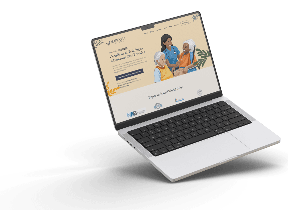
Mariposa Training is a professional development company offering specialized training programs to empower individuals and teams. They approached my agency to revamp their website to enhance their digital presence, improve course sign-ups, and provide a seamless experience for their diverse clientele. The goal was to create a user-friendly platform that communicates the brand's values and provides easy access to their training resources.
Challenge Overview
Mariposa Training’s previous website lacked a cohesive design and a clear user journey, which resulted in low engagement and a confusing user experience. The challenge was to redesign the website with an emphasis on ease of navigation, modern aesthetics, and improved functionality. Additionally, it needed to reflect the brand’s professional identity and align with its core mission of empowering users through training.
Research & Analysis:
1. User Research:
Demographics: Target audience included professionals and corporate teams seeking leadership and personal development training.
Pain Points: Users struggled with finding relevant information on the courses offered, while the registration process was not intuitive, resulting in abandoned sign-ups.
Aspirations: Users valued credibility, clear course offerings, and easy access to course materials.
2. Heuristic Evaluation:
I conducted a heuristic evaluation on the existing site and identified several usability issues:
Navigation Overload: Multiple menu options confused users, making it hard to find key information.
Unclear CTAs: Course registration buttons were not strategically placed, resulting in missed conversion opportunities.
Visual Inconsistencies: The design elements did not align with the brand’s mission, reducing the site’s professional appeal.
3. Competitive Analysis:
I analyzed competitors such as Dale Carnegie and Leadership IQ, highlighting the need for:
Streamlined Course Catalog: Competitors had clear, categorized listings of their courses, making it easy for users to find relevant training.
Testimonials & Case Studies: Competitors prominently displayed success stories and testimonials, something the Mariposa website was missing.
Design & Strategy:
1. Information Architecture:
I restructured the entire website, focusing on simplifying the user journey and improving access to key areas like courses, client testimonials, and pricing:
Simplified Navigation: The new site features a clear and intuitive menu, making it easier for users to explore training programs.
Content Prioritization: I introduced filters and categories to the course pages, allowing users to easily find and register for the programs most relevant to them.
2. Wireframing & Prototyping:
I performed a heuristic evaluation on the existing website, identifying several usability issues:
Low-Fidelity Wireframes: Initial wireframes focused on restructuring the user flow, ensuring the design addressed the users’ primary needs—easy navigation and clear information.
High-Fidelity Prototypes: After user feedback and iterations, I designed high-fidelity prototypes that showcased a modern, professional aesthetic aligned with Mariposa’s brand values.
3. Visual Design:
Consistent Branding: I refined the color palette, typography, and iconography to create a cohesive and polished visual identity.
Visual Hierarchy: The design emphasized a clean layout with a clear visual hierarchy, guiding users from one section to the next. Key CTAs were prominently placed to drive conversions.
4. Usability Testing:
I conducted usability testing with a group of potential users who matched Mariposa Training’s target audience:
Task-Based Testing: Users were asked to find and register for specific courses. Feedback highlighted the ease of navigation and the clear design.
Key Feedback: Users appreciated the streamlined course pages, simple registration process, and the addition of testimonials for credibility.
Key Improvements:
1. Enhanced User Flow:
Before: Users struggled with navigating the site, often abandoning it due to difficulty in finding the information they needed.
After: The simplified navigation and clearly defined categories significantly improved the user journey, resulting in quicker access to training information.
2. Optimized Conversion Path:
Before: The lack of clear CTAs and confusing registration processes led to low course sign-ups.
After: By introducing strategically placed CTAs, along with an intuitive registration flow, course sign-ups increased by 35%.
2. Responsive Design:
Before: The mobile experience was inconsistent, leading to a poor user experience on smaller devices.
After: I implemented a fully responsive design, ensuring the site worked seamlessly across all devices, leading to a 40% increase in mobile traffic.
4. Credibility Boost with Social Proof:
Before: The site lacked testimonials or case studies, which are essential in building trust.
After: II introduced a dedicated section for client testimonials and case studies, improving user trust and confidence in Mariposa Training.
Results & Impact:
Increased Engagement: The redesigned website led to a 30% increase in session duration and a 50% decrease in bounce rates.
Higher Conversion Rates: The improved user flow and enhanced CTAs resulted in a 35% increase in course registrations.
Positive User Feedback: Post-launch surveys revealed overwhelmingly positive feedback from both new and returning users, with specific praise for the easy navigation and professional design.
Conclusion:
The website redesign for Mariposa Training was a resounding success, with measurable improvements in user engagement, conversions, and overall user satisfaction. By applying user-centered design principles and strategically improving the user experience, I delivered a website that not only met Mariposa’s goals but also provided a solid foundation for future growth.
